Dash app to visualize personal finance data.
I created a dash app in order to visualize my financial data. It allows me to see my expenses vs incomes, my liquidity, an overview of my investemnts amongh other things. The idea is that with the app I can have an overview of my situation and/or dive in detail using the app filters.
I belive it is really important to know what are your expenses and incomes and how they change through time. This is the key to have a good financial situation. This is why I decided to create something that could help me visualize my own financial data.
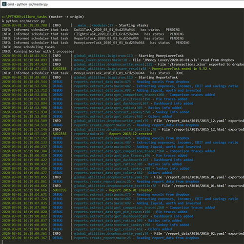
To record all the transactions I use Money Lover Android App. Amongh other things it allows user to export data into excel files (.xls) which then I get them loaded into dropbox using Autosync for Dropbox. From there the dash app can retrive the data using a dropbox token.

For the app itself is a multipaged dash app. It uses the dash-bootstrap library and some parts of w3css for the html part.
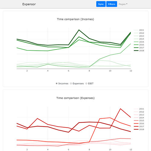
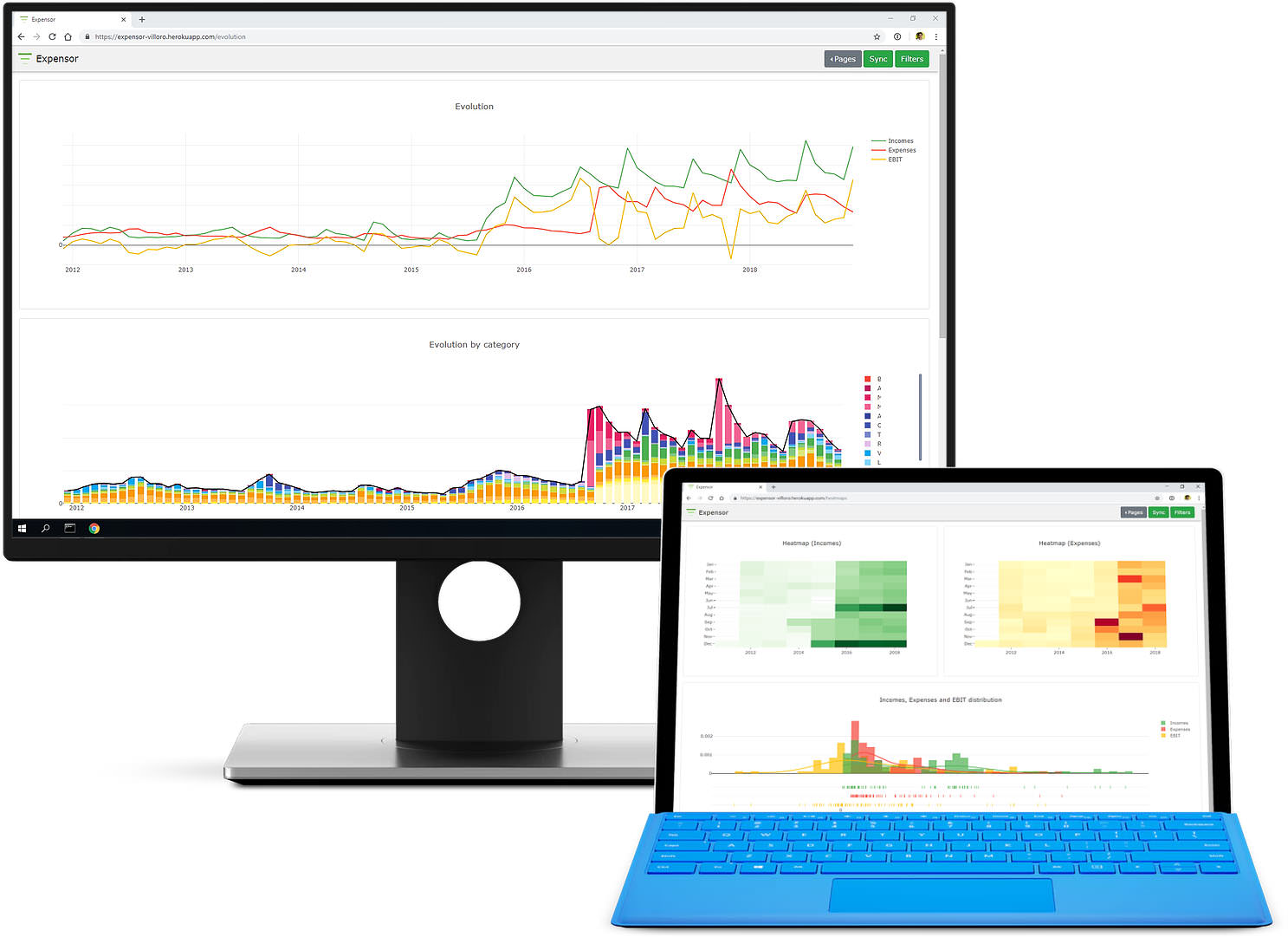
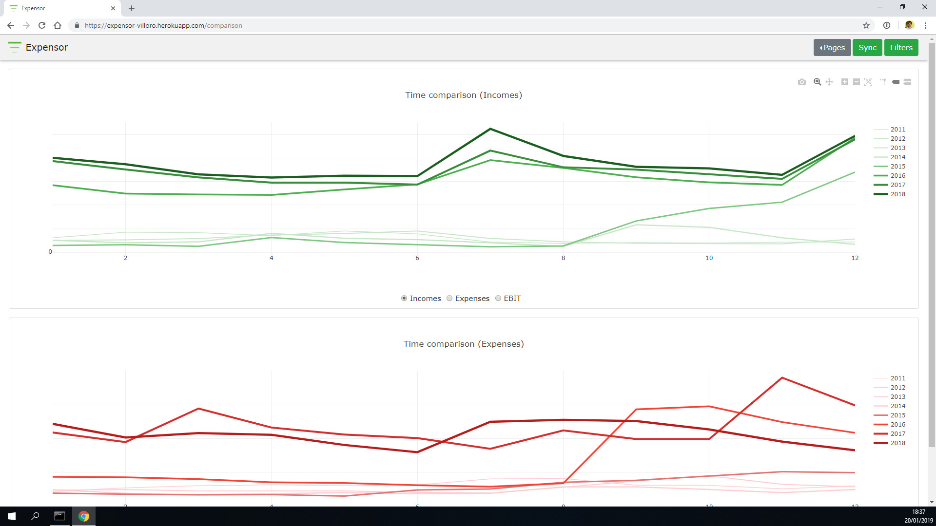
This page shows the evolution of the incomes, expenses and earning before interests and taxes (EBIT).
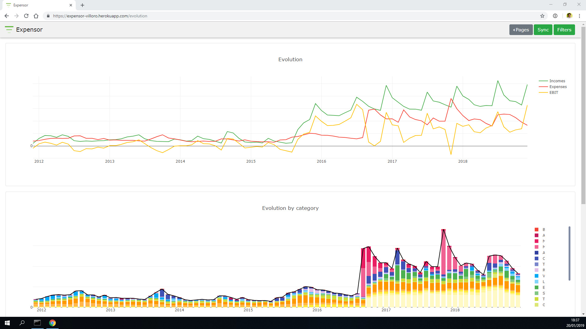
This is a comparison of both expenses and incomes over the years.
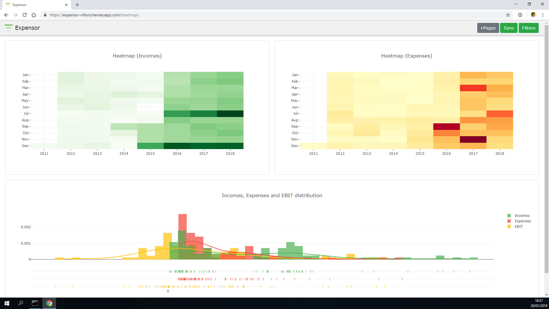
Below you can see both expenses and income headmaps along with a histogram.
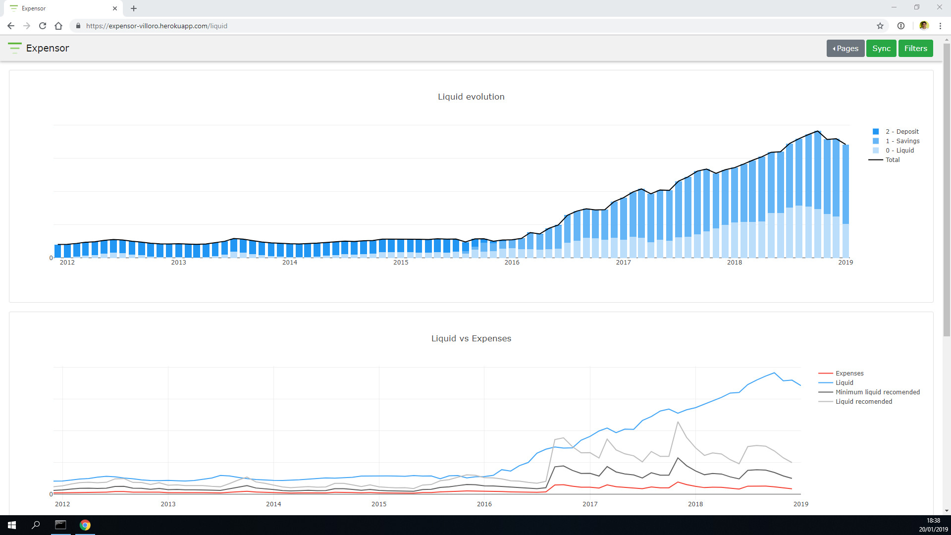
In this last page we can see the availabe liquid.